
Cloverland
Branding
Packaging
Illustration
Entering a saturated market of mid to high-end scented candle companies, Cloverland needed a brand that established its quality and highlighted their unique mission: creating candles for homebodies, and donating with every purchase to charitable organizations who promote home ownership in under-served communities.
Abstract icons created to represent the different product scent notes

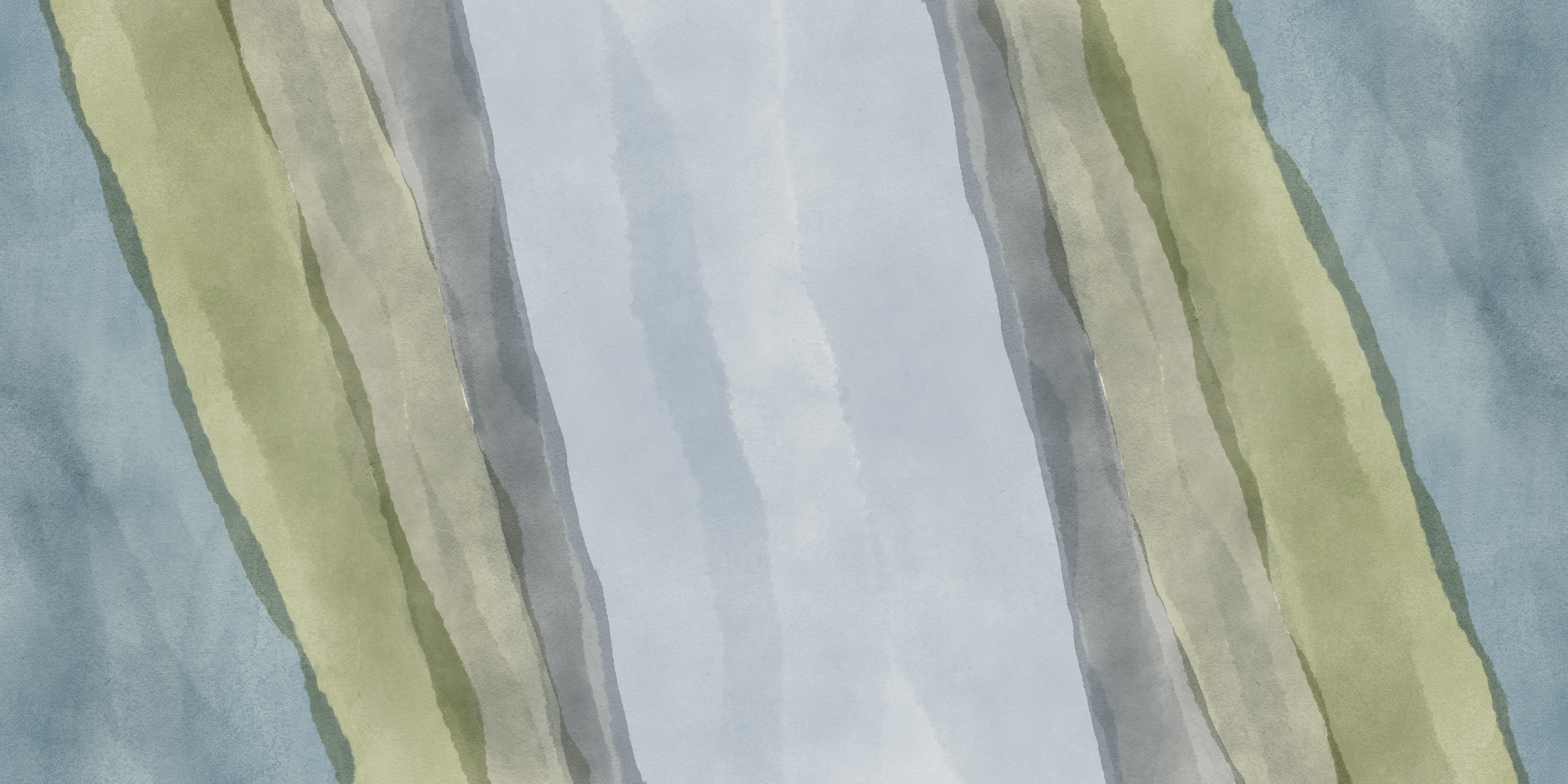
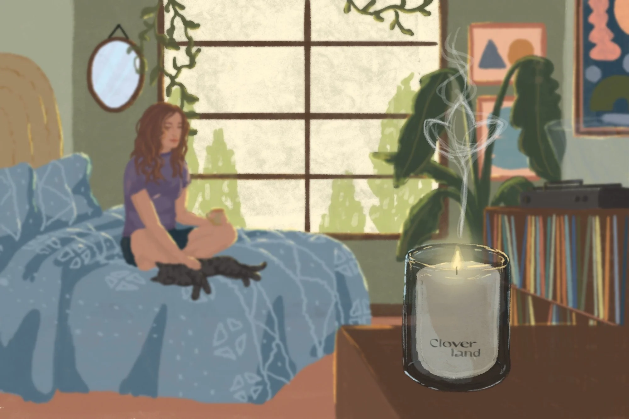
I created three immersive banner illustrations for the Cloverland website. Each showcases a different expression of relaxation and coziness, inviting website visitors to imagine their candle in the peaceful context of their own home. Each illustration depicts a different time of day: morning, afternoon, and evening).


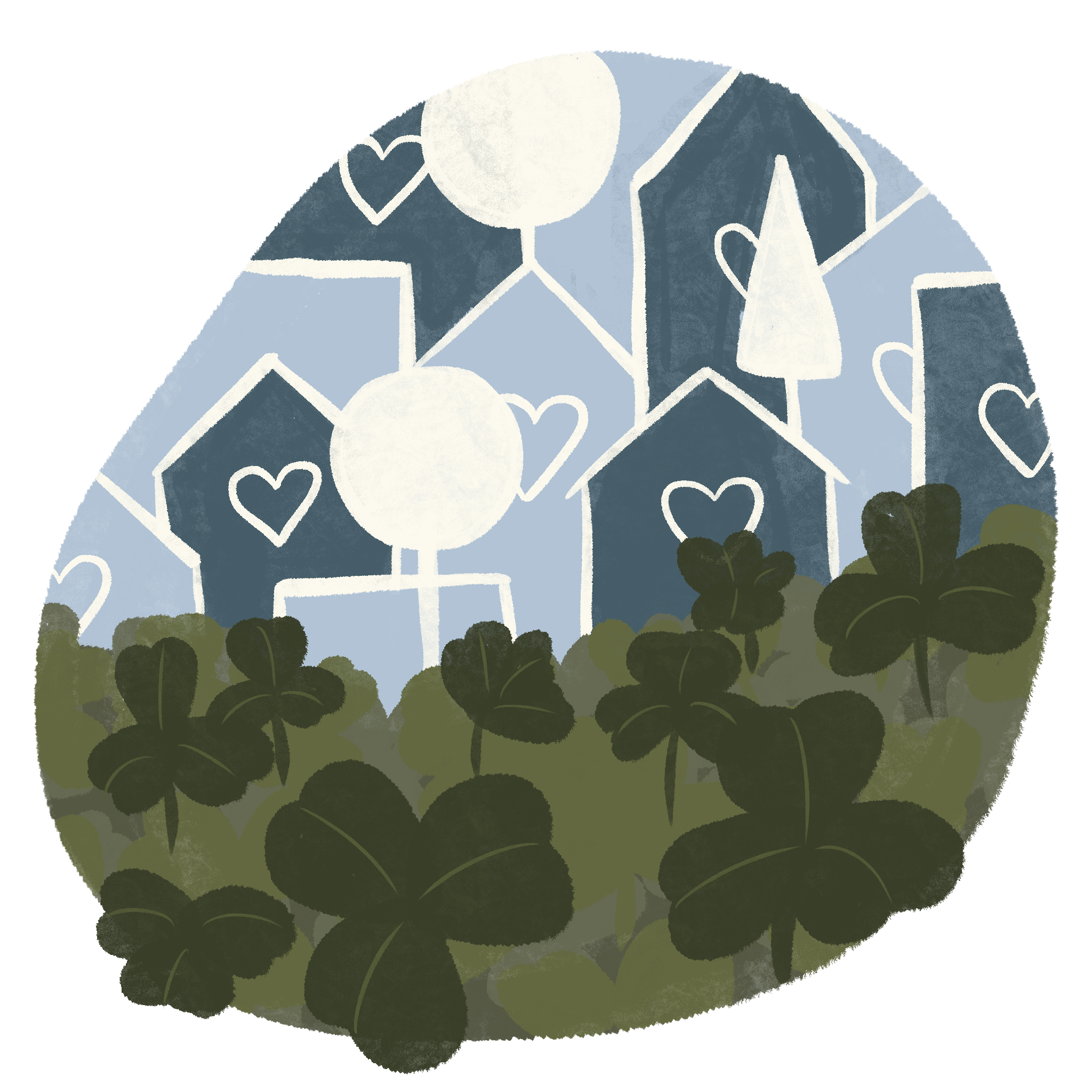
Additional Website Illustrations

“Behind the Name”

“Earth-Friendly”
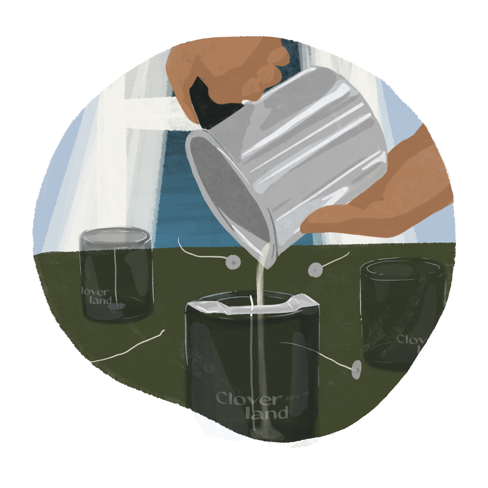
“Hand-Poured”

“My Story”
“Purpose-Driven”

Scent Cards
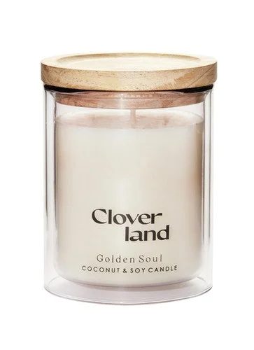
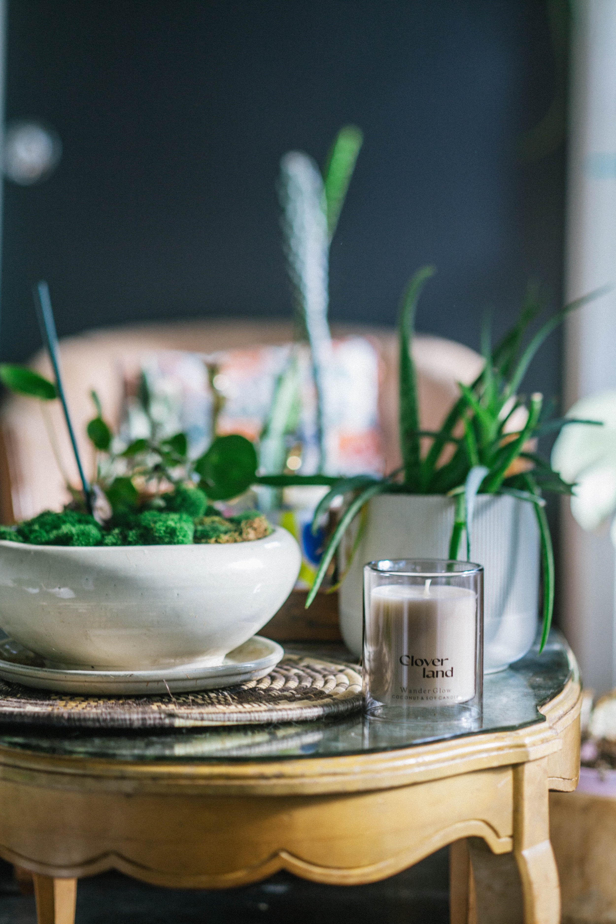
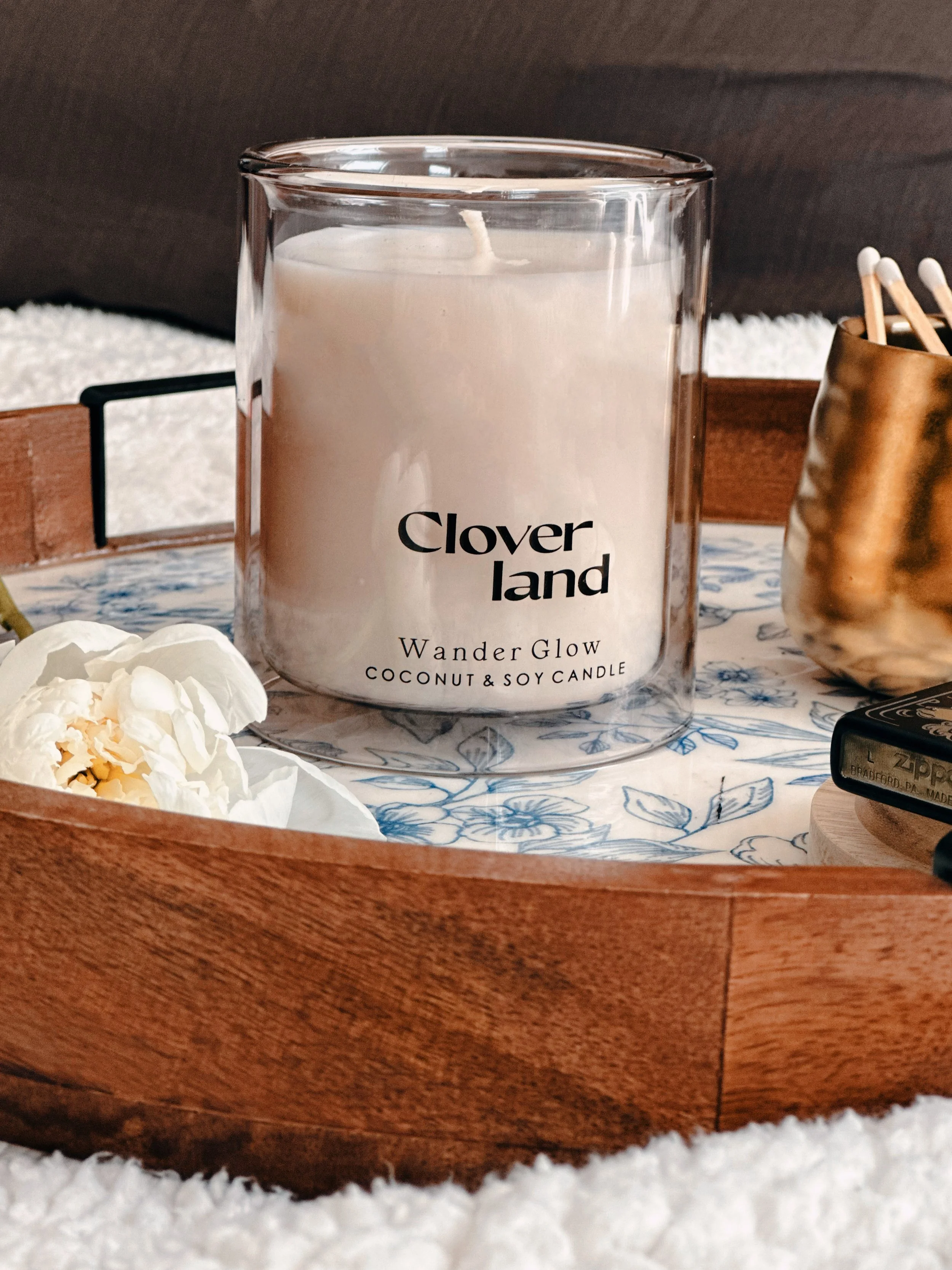
The candle packaging design helped to further the elevated and relaxing customer experience by utilizing the unique tube shape and featuring custom watercolor-inspired imagery.